Recap
In this course, we learned first that structures allow us to describe data – for example, hockey cards, book listings, people, and so forth.
Structures contain both stored properties that hold individual pieces of data and computed properties that perform calculations with data. For example, a Circle structure can store the radius of a circle. What that information, the structure can report on, or compute, its diameter, area, and circumference.
A protocol defines one or more rules that a structure must follow.
Structures that conform to (follow the rules of) the View protocol must have a computed property named body that returns one and only one structure that also conforms to the View protocol. However, that structure can itself contain another view.
We did this yesterday, with the following initial example:
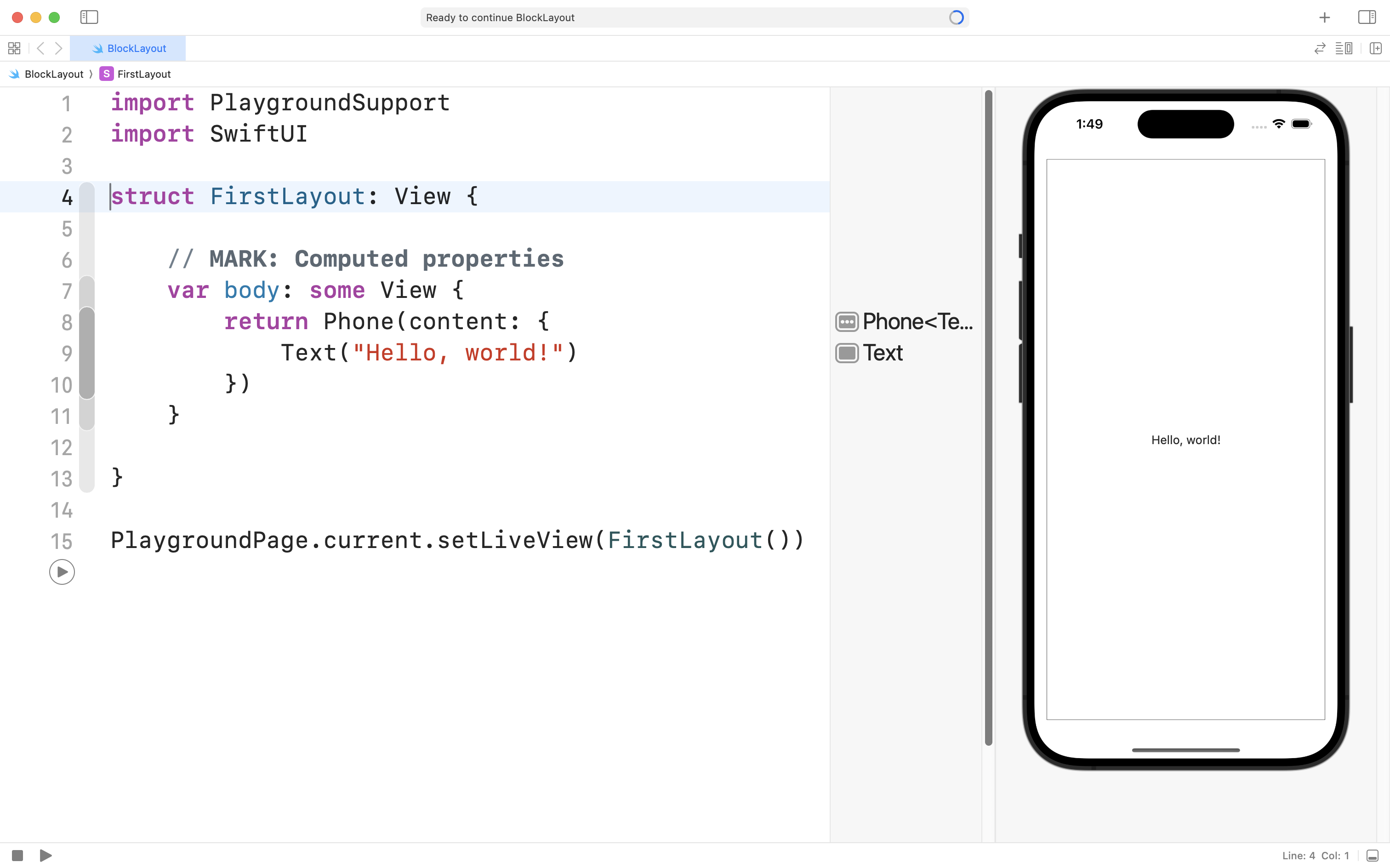
Here, the FirstLayout structure conforms to the View protocol (line 4).
It follows the rules of that protocol by defining a body property (lines 7 to 11).
Specifically, an instance of the Phone structure is returned (lines 8 to 10).
The Phone structure has one parameter, or question that must be answered – what content do you want me to show? We provide a block of code to answer that question – we ask it to show a Text structure that says "Hello, world!"
Using structures that conform to the View protocol is somewhat like nesting Russian dolls:

In this way, using the SwiftUI framework and its long list of pre-defined structures for user-interface elements, we can describe very rich, functional, and attractive user interfaces for our apps.
Finally, the Swift programming language does allow us to streamline syntax. This short 55-second video shows how the code shown above can be simplified further:
Layout views
Recall the following:
VStack- Positions views contained inside of it vertically.
HStack- Positions views inside of it horizontally.
ZStack- Positions views inside of it using layers.
- The first view is the bottom layer.
- The final view is the top layer.
Push-out views
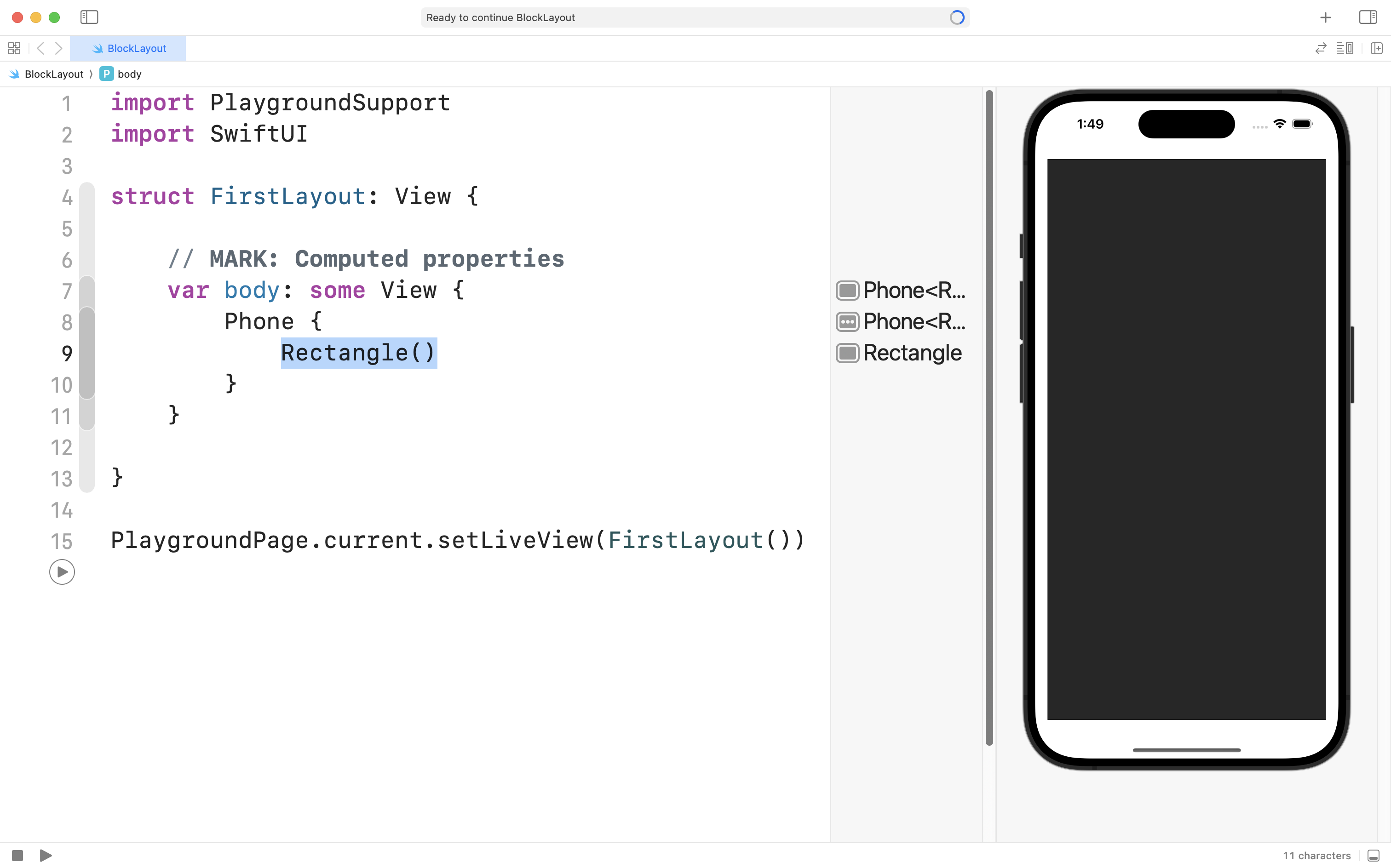
The Rectangle structure is a “push out” view – it is greedy and will take up as much space as possible:
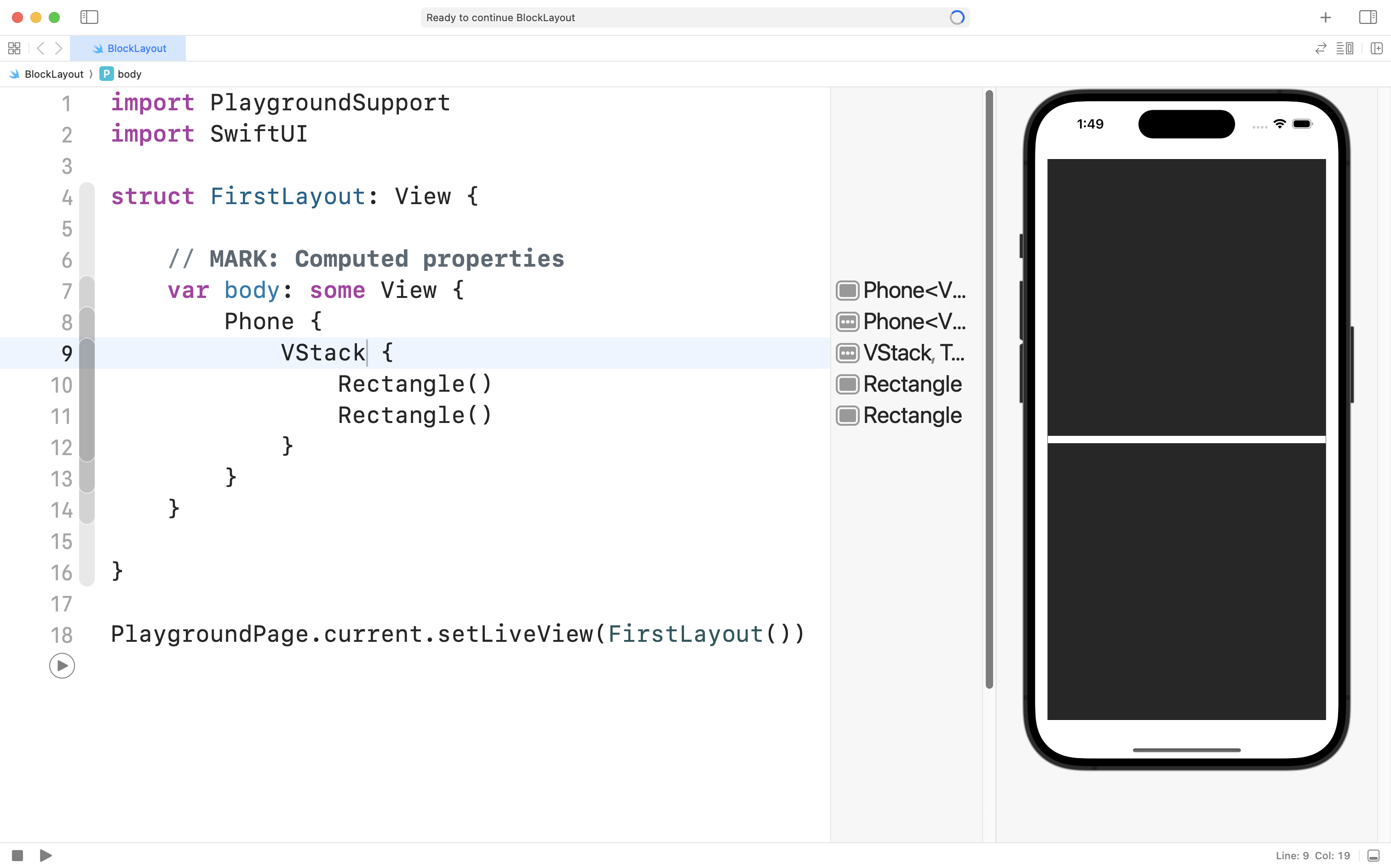
When we put two push-out views inside a stack, the stack will evenly divide its available space between the children views:
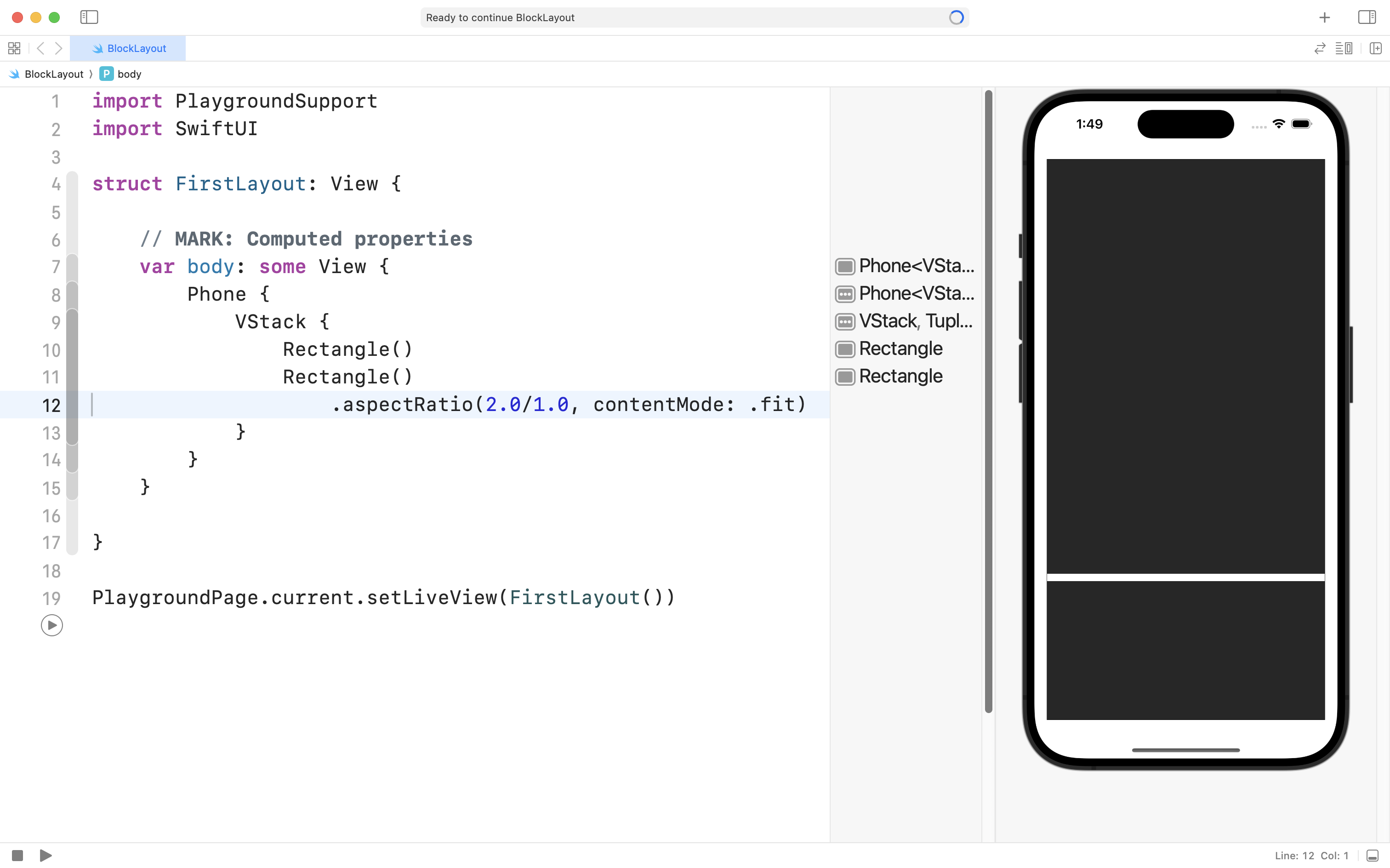
View modifiers allow us to change how a view presents itself.
Here, we use the .aspectRatio view modifier to tell the second rectangle to ensure it is always twice as wide as it is tall:
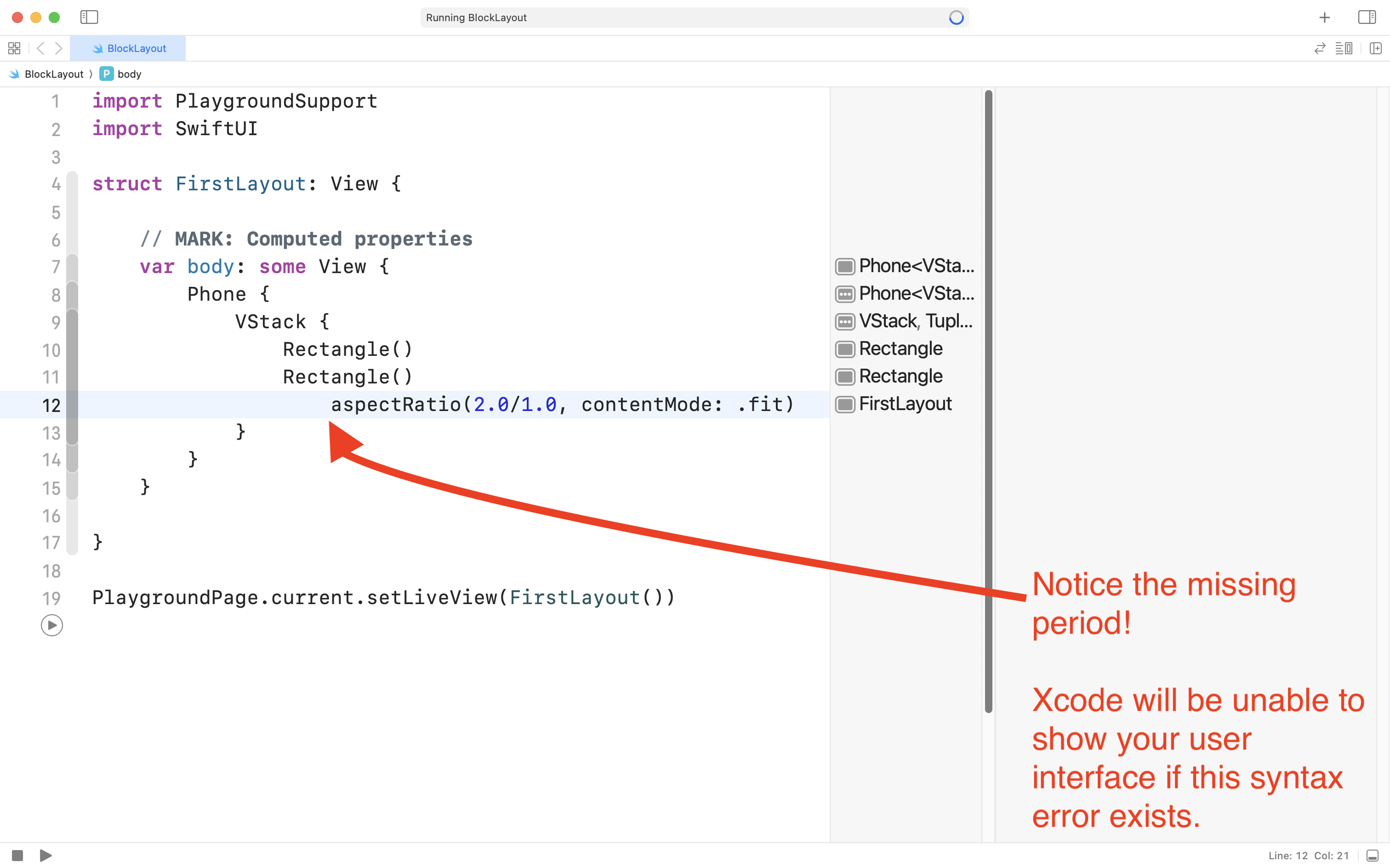
TIP
When adding a view modifier, don’t forget the
.that comes before it!Forgetting the
.character is a very common syntax error that is easy to make and very hard to spot.If you ever find that Xcode is struggling to present your user interface, double-check that you haven’t created a syntax error like this!
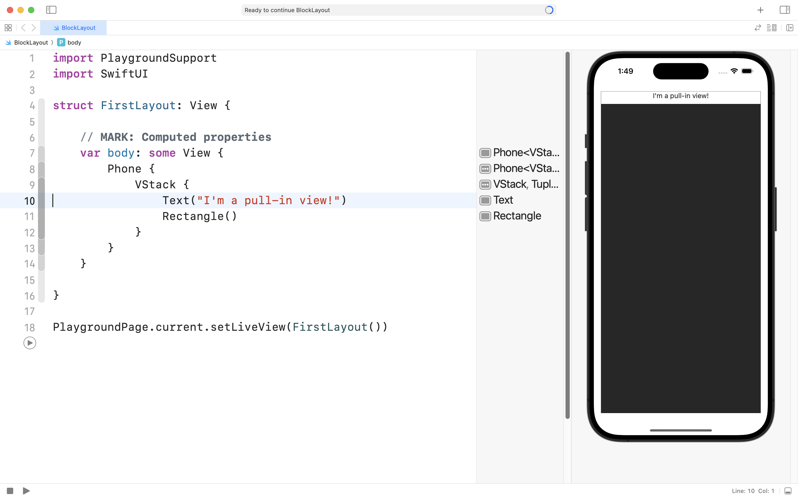
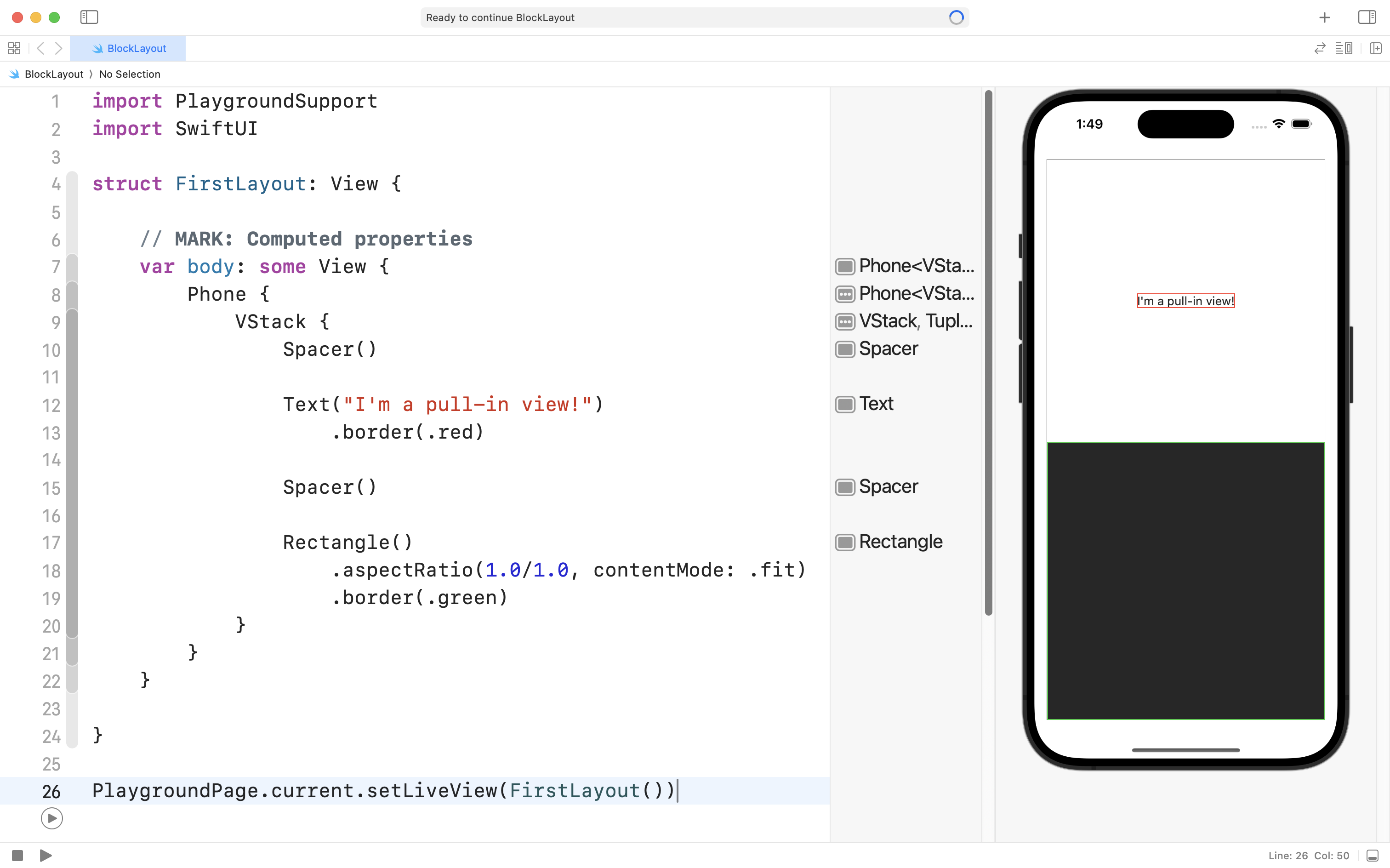
Pull-in views
Text views are an example of “pull-in” views. These views are “polite” – they only take up as much space as they need:
If you’re ever confused about where the boundaries of a view are, add the .border() view modifier to each view:
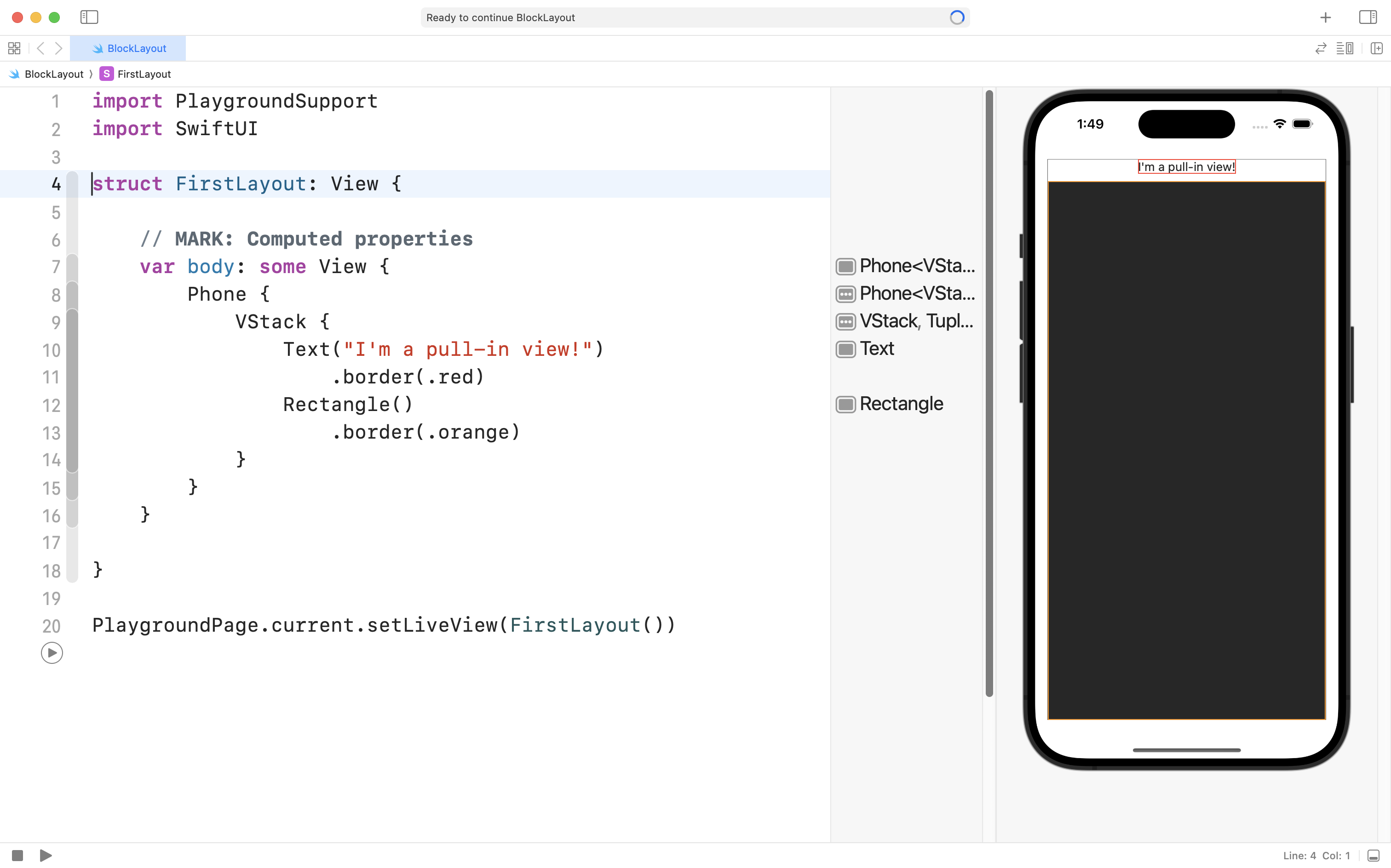
A very fine border is added to the edge of each view, making it easier to see what is happening.
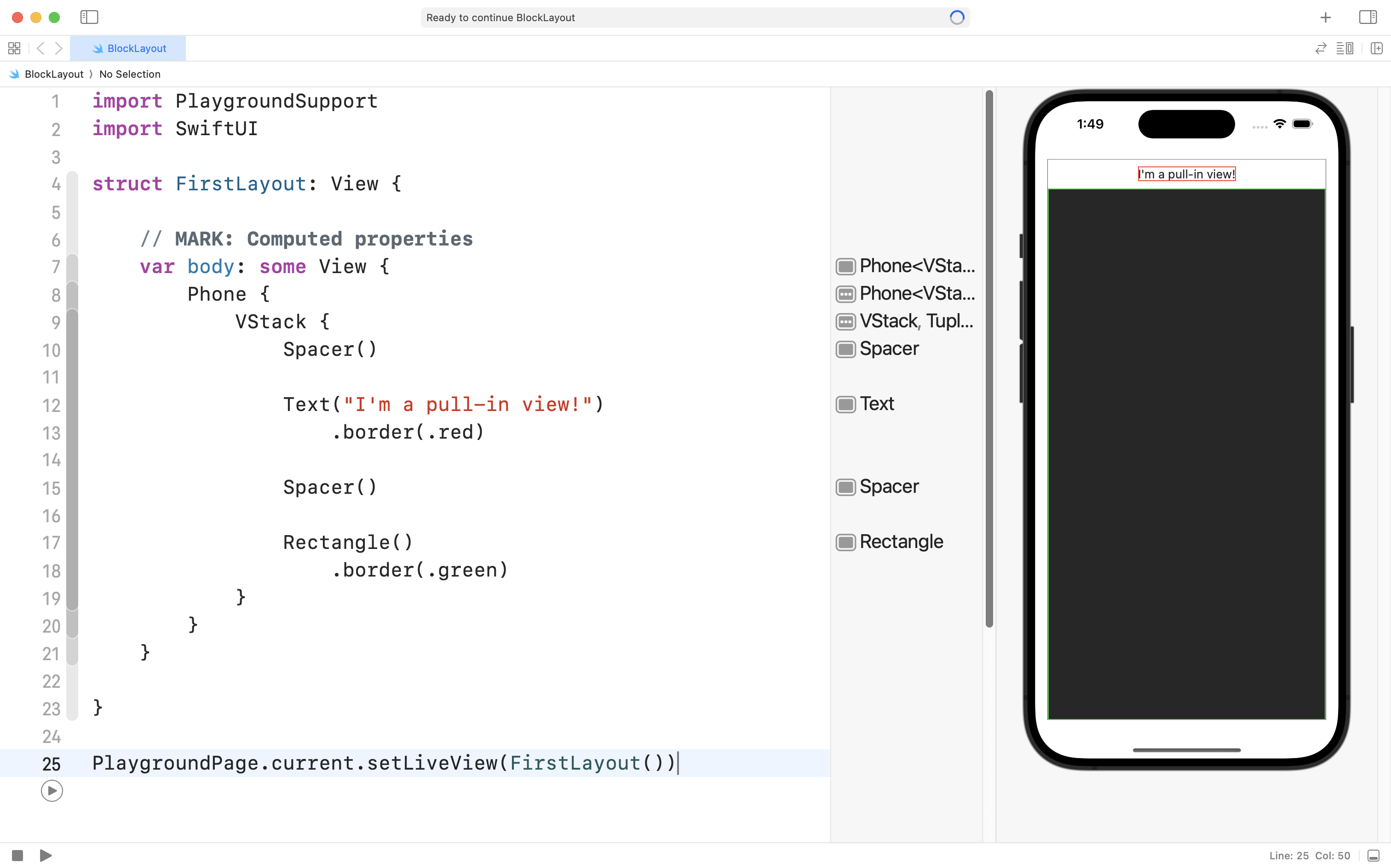
Spacer
Let’s say that you wanted to place some text above the bottom rectangle, but have some negative (empty) space around it.
One way you can do that is by using the .aspectRatio view modifier on the bottom rectangle:
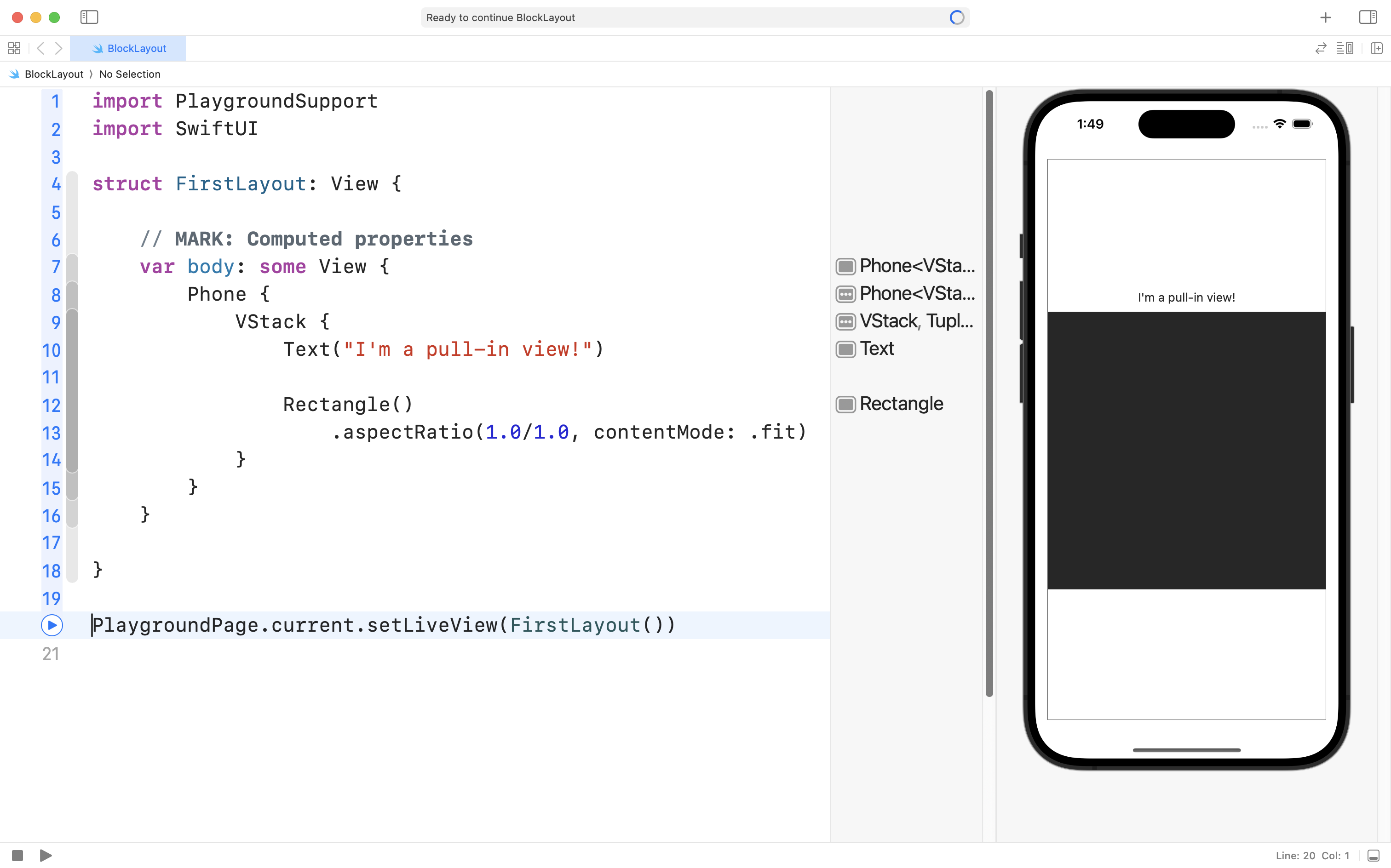
However, this is not quite right. Remember, the Text view is “pull-in”, meaning it won’t take up any more space than it needs. The rectangle is making itself square (width is same as height), and there is “leftover” space inside the vertical stack since the Text view is being polite and only taking up as much space as it needs.
We can fix this by introducing Spacer views.
Spacer views are invisible push-out views that can “boss around” pull-in views like a text view. Have a look:
Be careful though – in a “fight” with push-out views like a Rectangle, the Spacer will lose – look what happens when we remove the .aspectRatio view modifier from the Rectangle:
Multi-line text
If a text view has a lot of text in it, it will push out to take as much space as it needs. Here is an example:
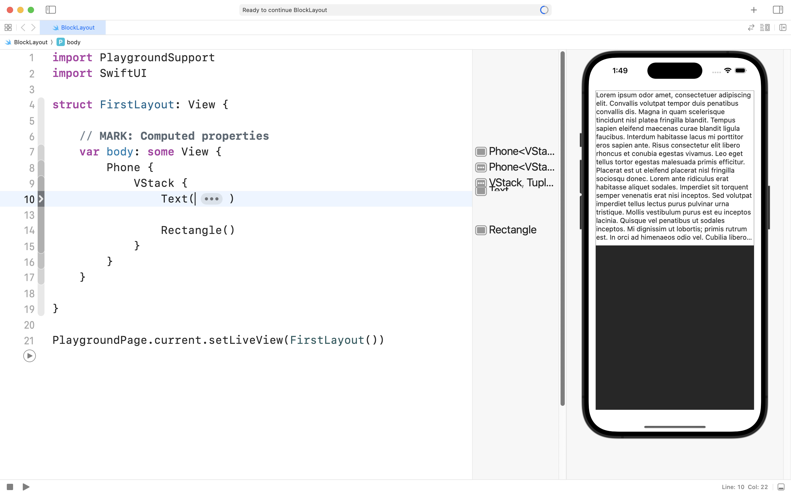
NOTE
The
Textview could use more space (if it was given that space) but it only gets half the available height from theVStack, it’s parent. TheTextview indicates that it has more text to show by adding an ellipsis, that is, three short dots:...at the end of the text it shows.
In the code window above, the Text view is folded up, using the code-folding feature in Xcode, to conceal what it contains.
It is usually easier to provide a lot of text to a Text view using a multi-line string. Multi-line strings are marked by three quotes: """ at the start and end of the string.
Here is the full code for the example shown above:
import PlaygroundSupport
import SwiftUI

struct FirstLayout: View {

    // MARK: Computed properties
    var body: some View {
        Phone {
            VStack {
                Text("""
                    Lorem ipsum odor amet, consectetuer adipiscing elit. Convallis volutpat tempor duis penatibus convallis dis. Magna in quam scelerisque tincidunt nisl platea fringilla blandit. Tempus sapien eleifend maecenas curae blandit ligula faucibus. Interdum habitasse lacus mi porttitor eros sapien ante. Risus consectetur elit libero rhoncus et conubia egestas vivamus. Leo eget tellus tortor egestas malesuada primis efficitur. Placerat est ut eleifend placerat nisl fringilla sociosqu donec.Lorem ante ridiculus erat habitasse aliquet sodales. Imperdiet sit torquent semper venenatis erat nisi inceptos. Sed volutpat imperdiet tellus lectus purus pulvinar urna tristique. Mollis vestibulum purus est eu inceptos lacinia. Quisque vel penatibus ut sodales inceptos. Mi dignissim ut lobortis; primis rutrum est. In orci ad himenaeos odio vel. Cubilia libero volutpat fringilla mattis dapibus luctus bibendum. Et nulla mus magna turpis inceptos ullamcorper risus.
                    """)

                Rectangle()
            }
        }
    }

}

PlaygroundPage.current.setLiveView(FirstLayout())
Styling Text
There are many view modifiers that can be used to control the size of text.
Here are some examples.
Exercises
Use the new concepts introduced here to reproduce as many of these layouts as you can – challenge yourself with some tricky ones as you get more comfortable!
Use the Xcode playground that you created in our most recent class.