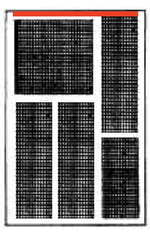
Using aspect ratios
One of the exercises from Block Layouts prompted a few questions through portfolio posts:
This is an interesting layout to consider, and it is possible to complete this exercise entirely with the use of nested HStack and VStack structures, together with some use of the .aspectRatio view modifier.
To get started, we might notice there are elements that share a horizontal axis. So we could start to implement this layout with an HStack:
Then we notice that within each column on the left and right, there are elements arranged vertically:
That implies the addition of VStack structures:
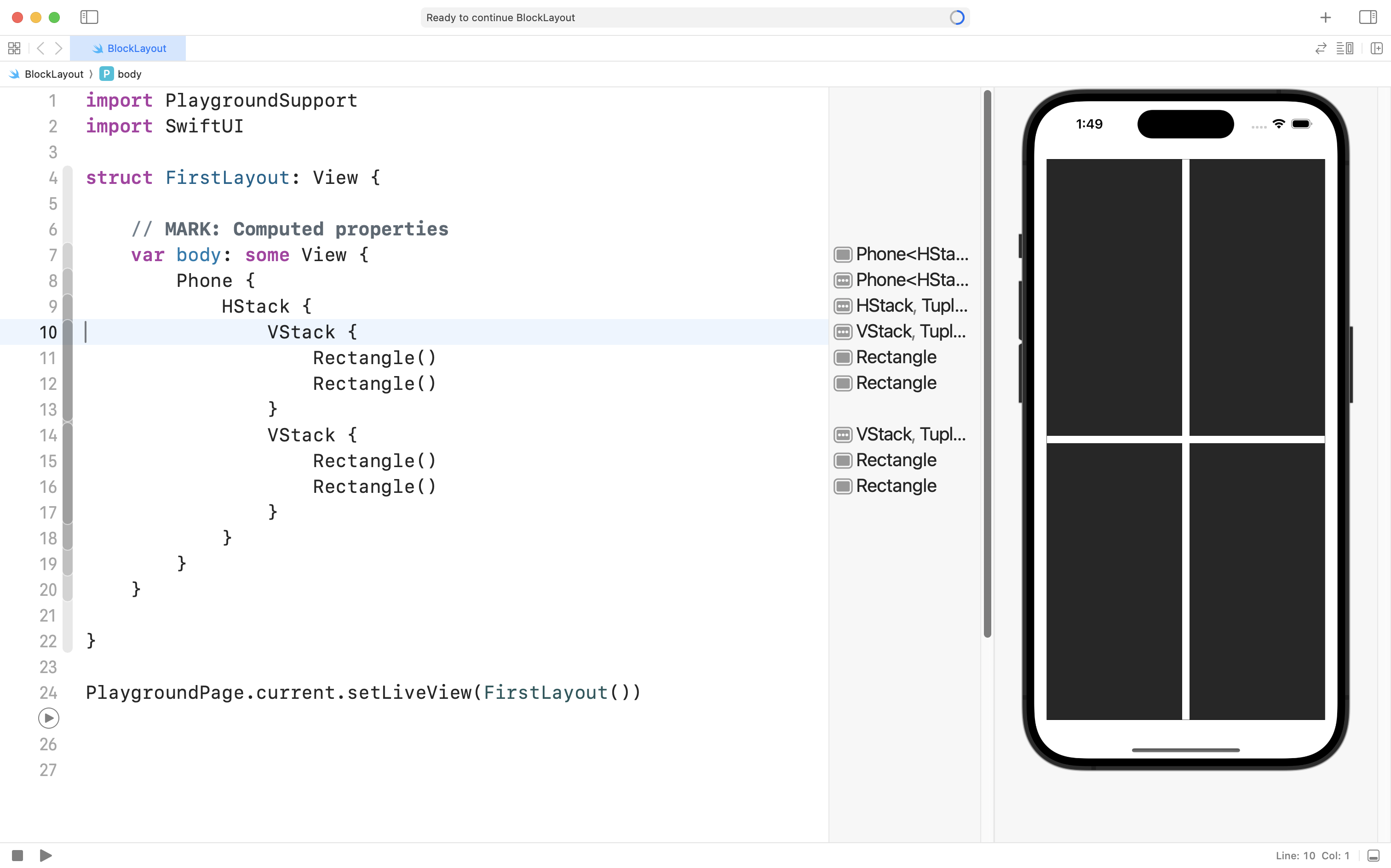
Then, we might see that the bottom-left corner is meant to have two columns side by side:
So we could add an HStack there:
We are making good progress.
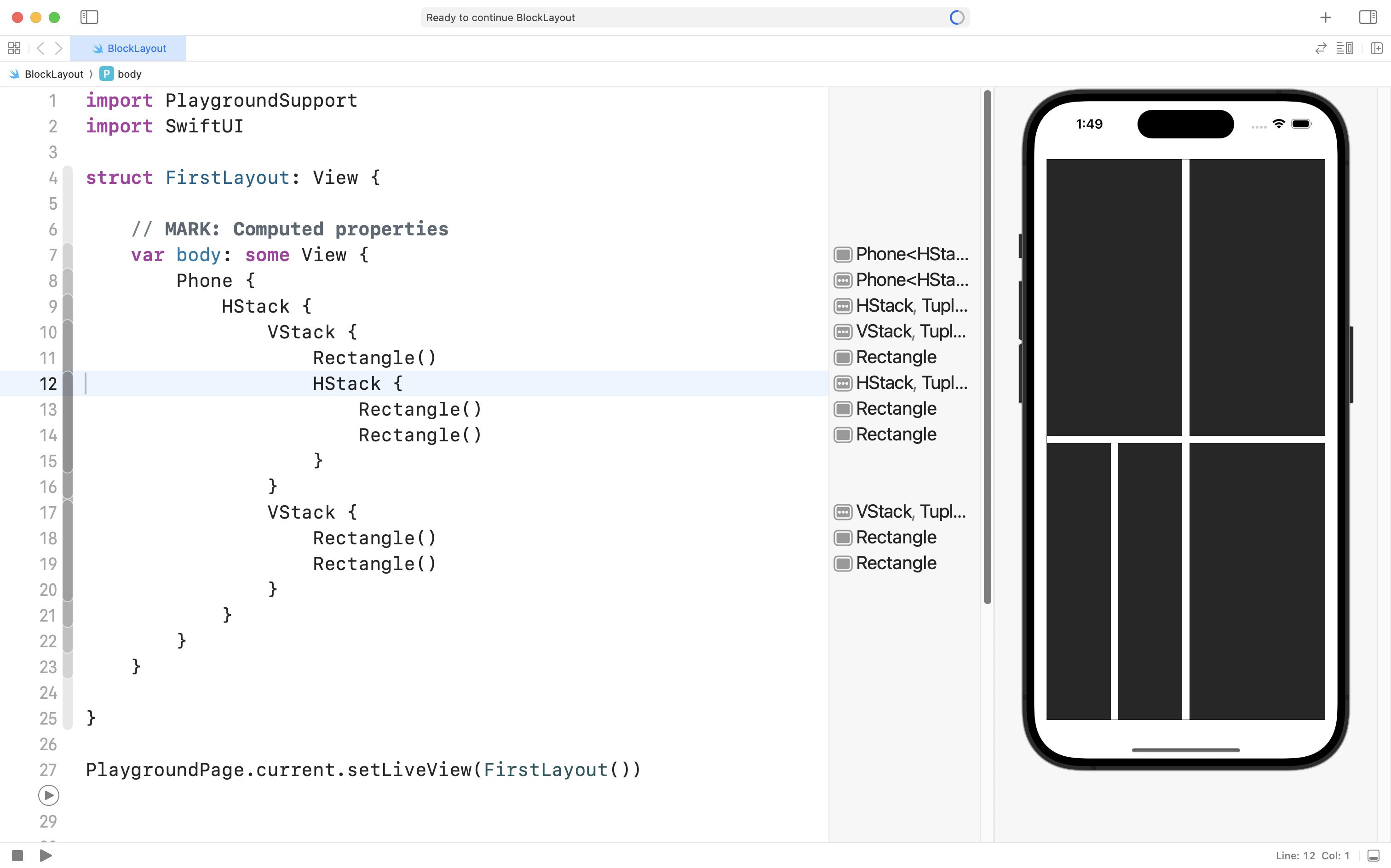
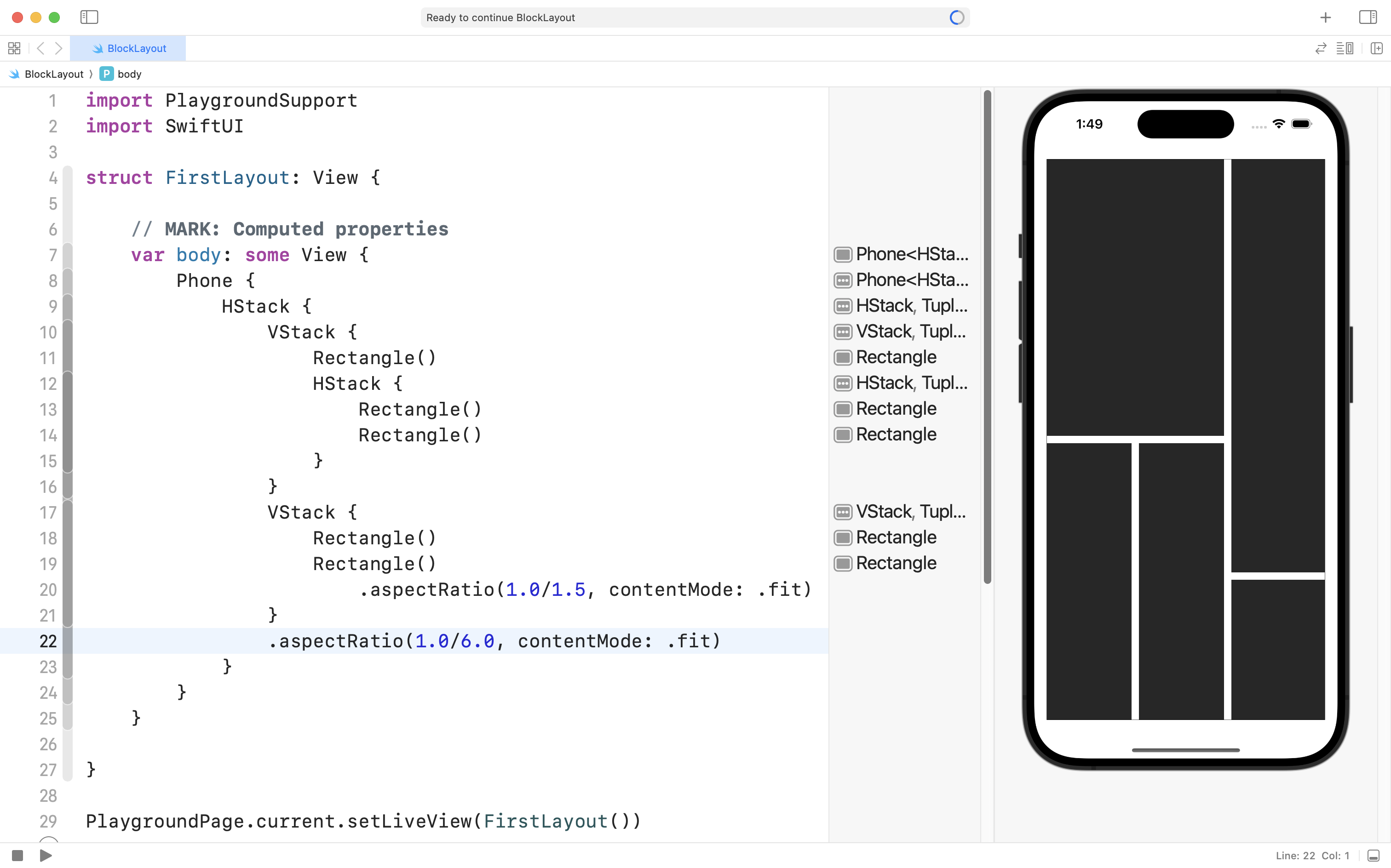
At this point we might try using a view modifier to adjust the aspect ratio of the bottom-right rectangle:
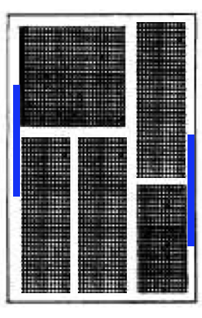
… and this gets us very close to the desired layout, but, we have not addressed the fact that the left side of the layout is meant to be about two-thirds of the overall width of the layout:
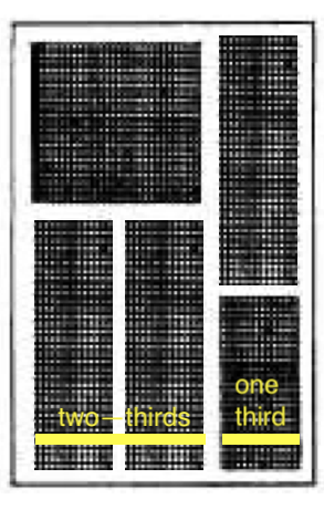
We face this challenge because the top-level HStack in this layout divides it’s available space evenly between it’s immediate children, the two VStack structures.
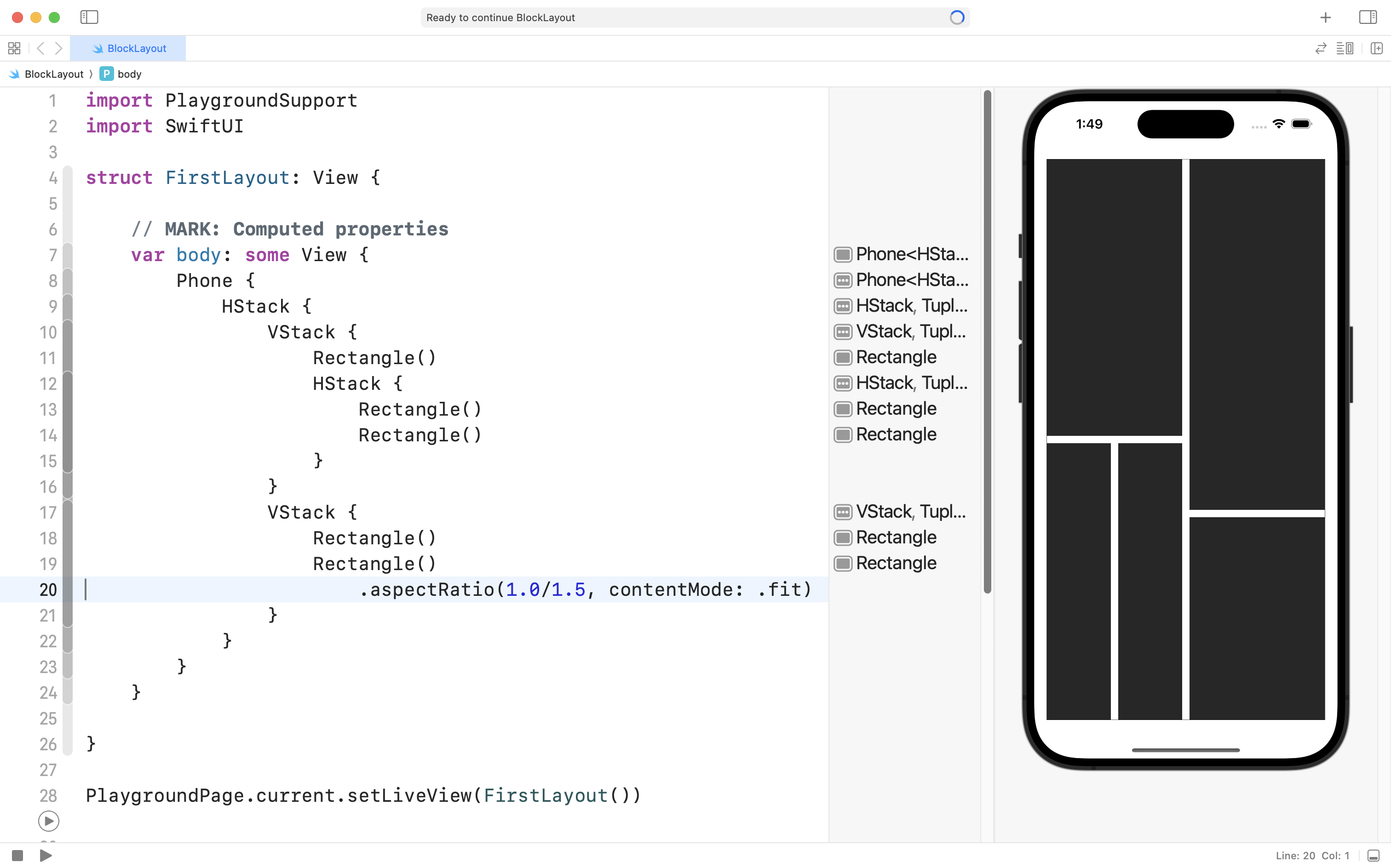
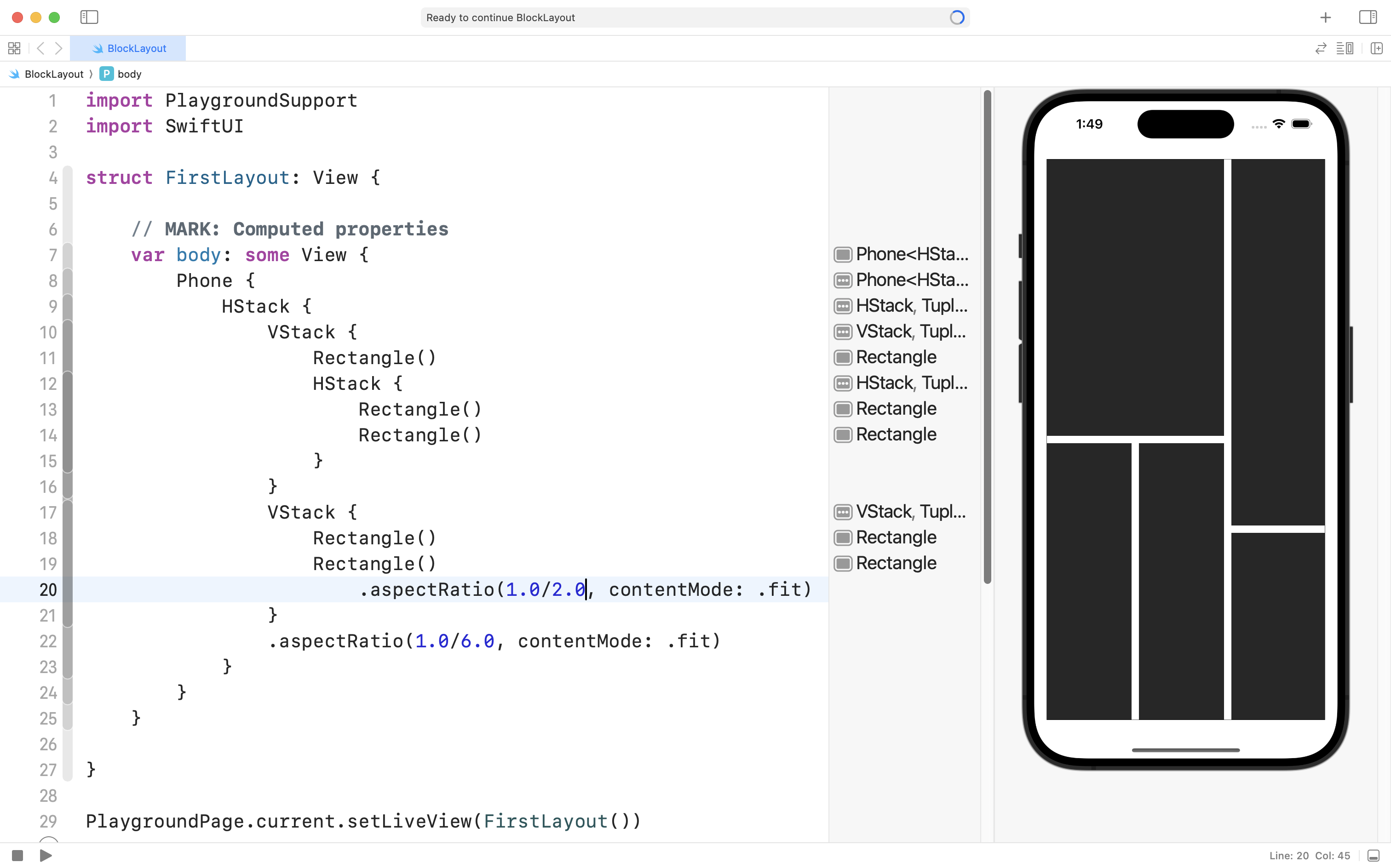
We can adjust this behaviour by attaching a view modifier to the second VStack, forcing it to have an overall smaller width:
Here, we are saying: “make this VStack have a height that is always six times larger than its width”.
And that does get us pretty close to the desired target layout.
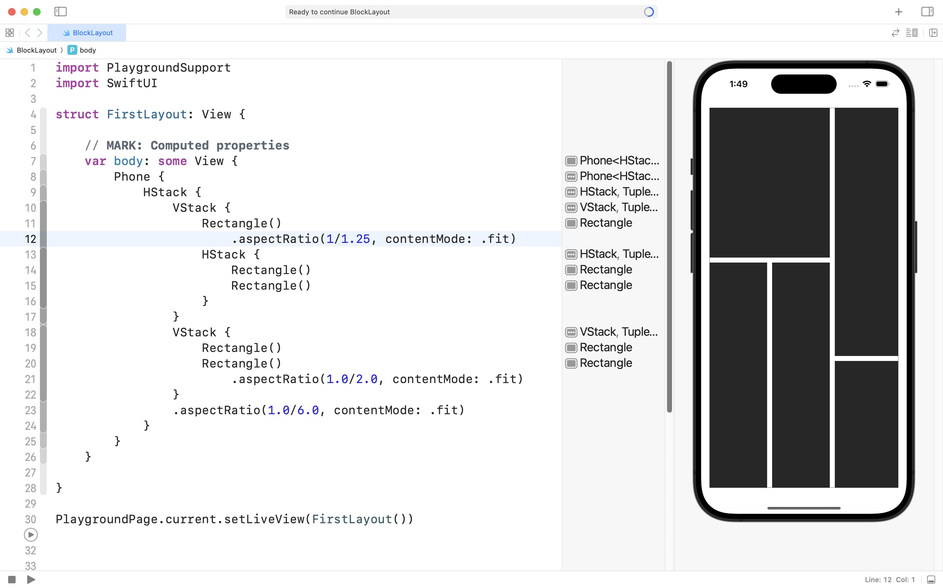
We could adjust the other aspect ratio view modifier a little bit to get even closer:
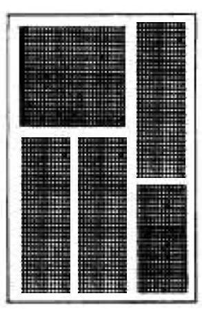
We are really close:
If we add one more view modifier to the top-left rectangle to make it a bit shorter, vertically:
… we are pretty much done.
Making the layout adaptive
Using aspect ratio view modifiers does get the job done, but, as we will learn in detail later in this course, layouts need to adapt to different screen sizes.
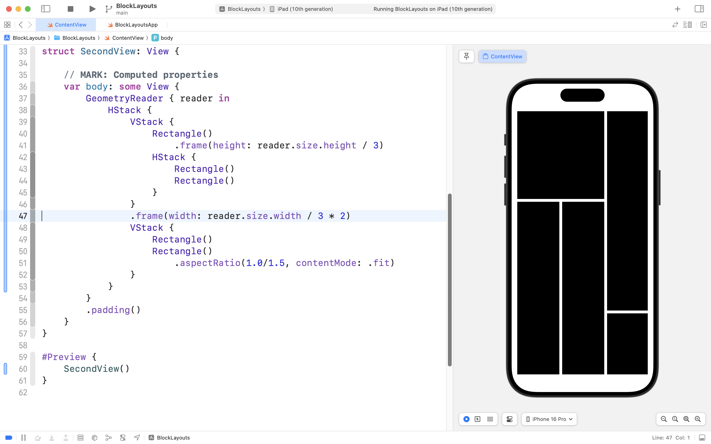
On an iPhone 16 Pro, the layout we’ve authored looks great:
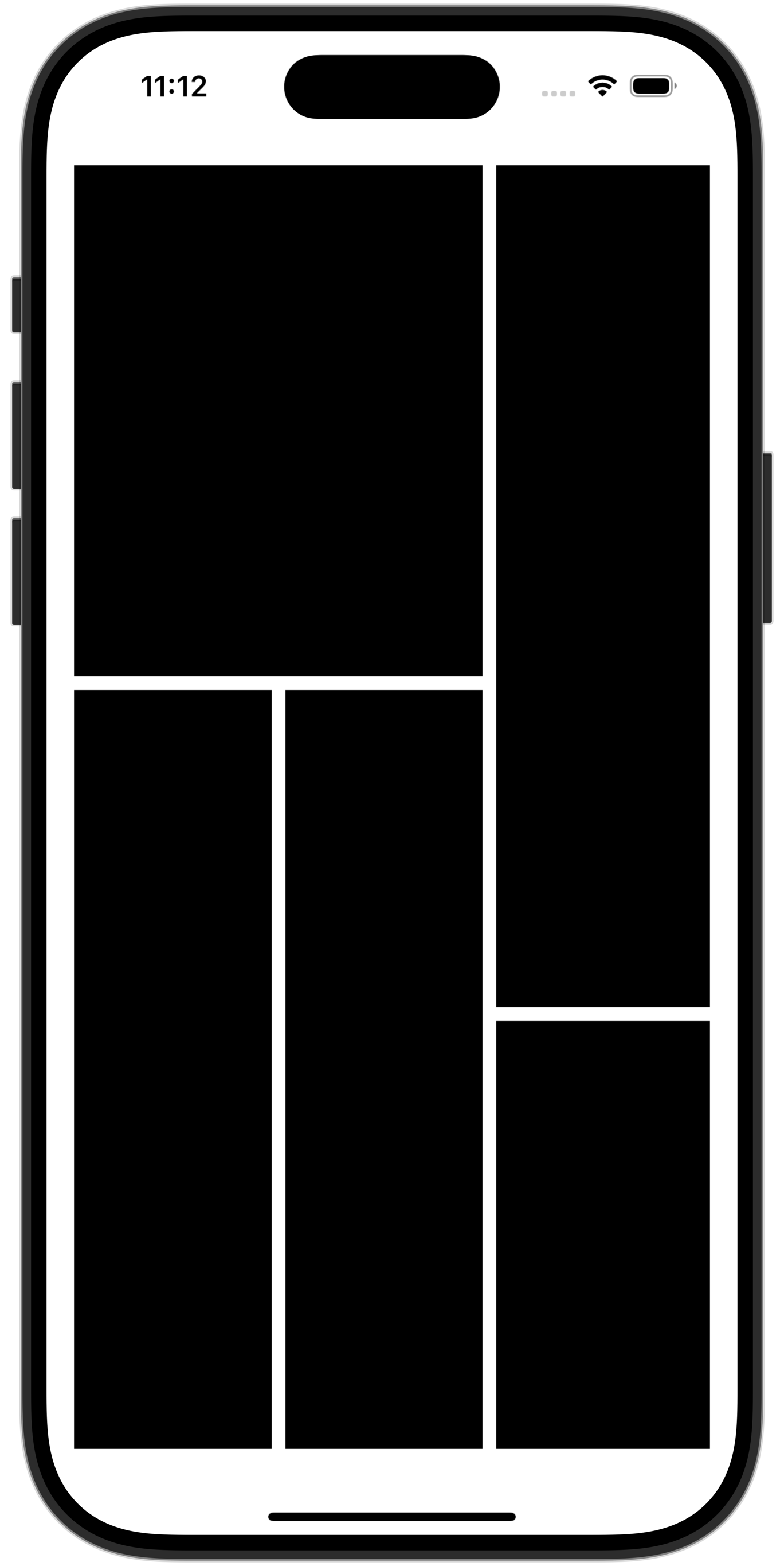
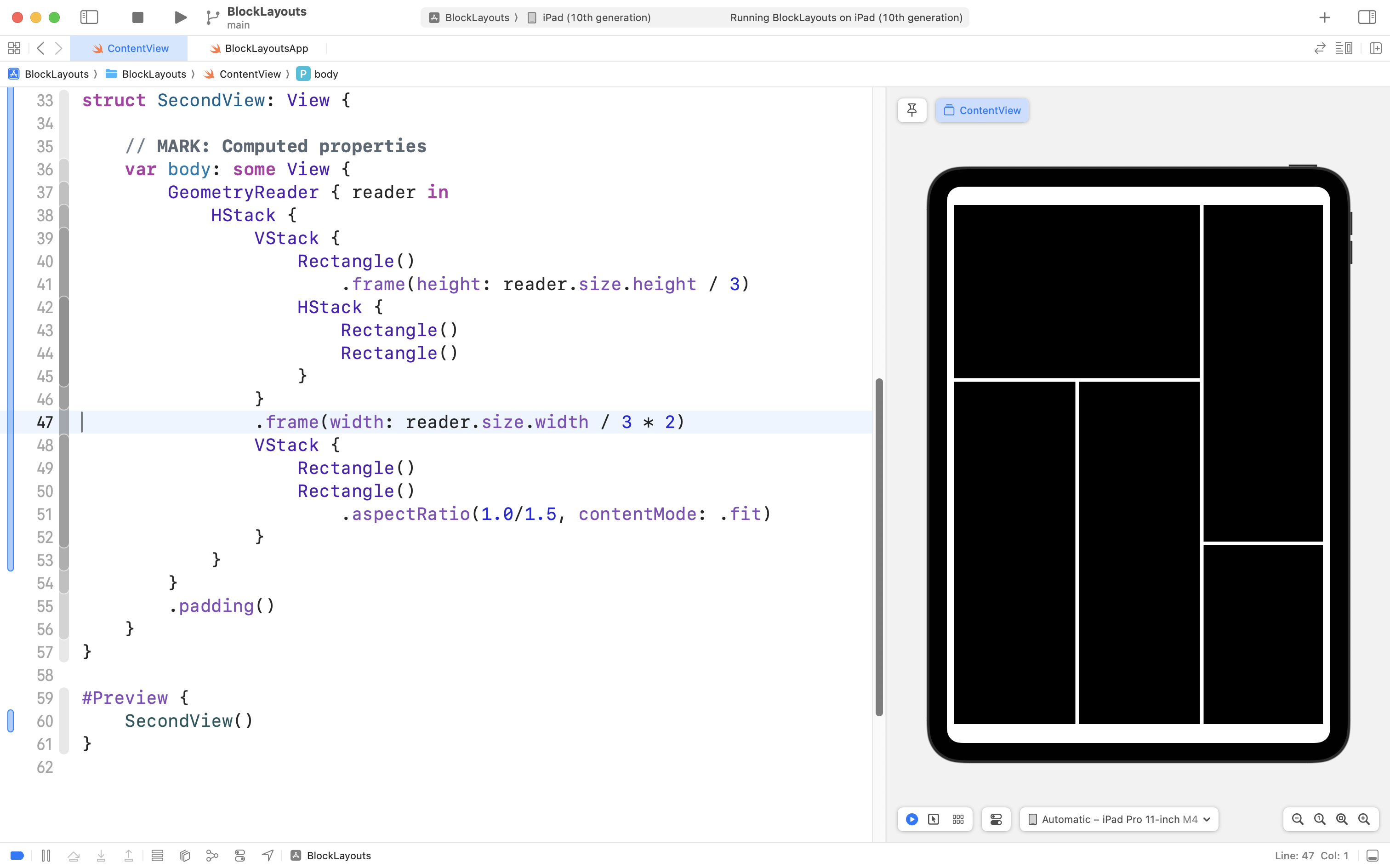
However, on a 10” iPad, the layout does not look correct at all:
_10.9_2024-10-26_11.13.58.png)
For a complex layout like this one, rather than specifying the aspect ratio of a single element of the layout (such as the top-left rectangle) it is easier to describe the size we want in terms of the overall width and height of the device itself.
How, though, can we do that?
This is where the GeometryReader structure is useful.
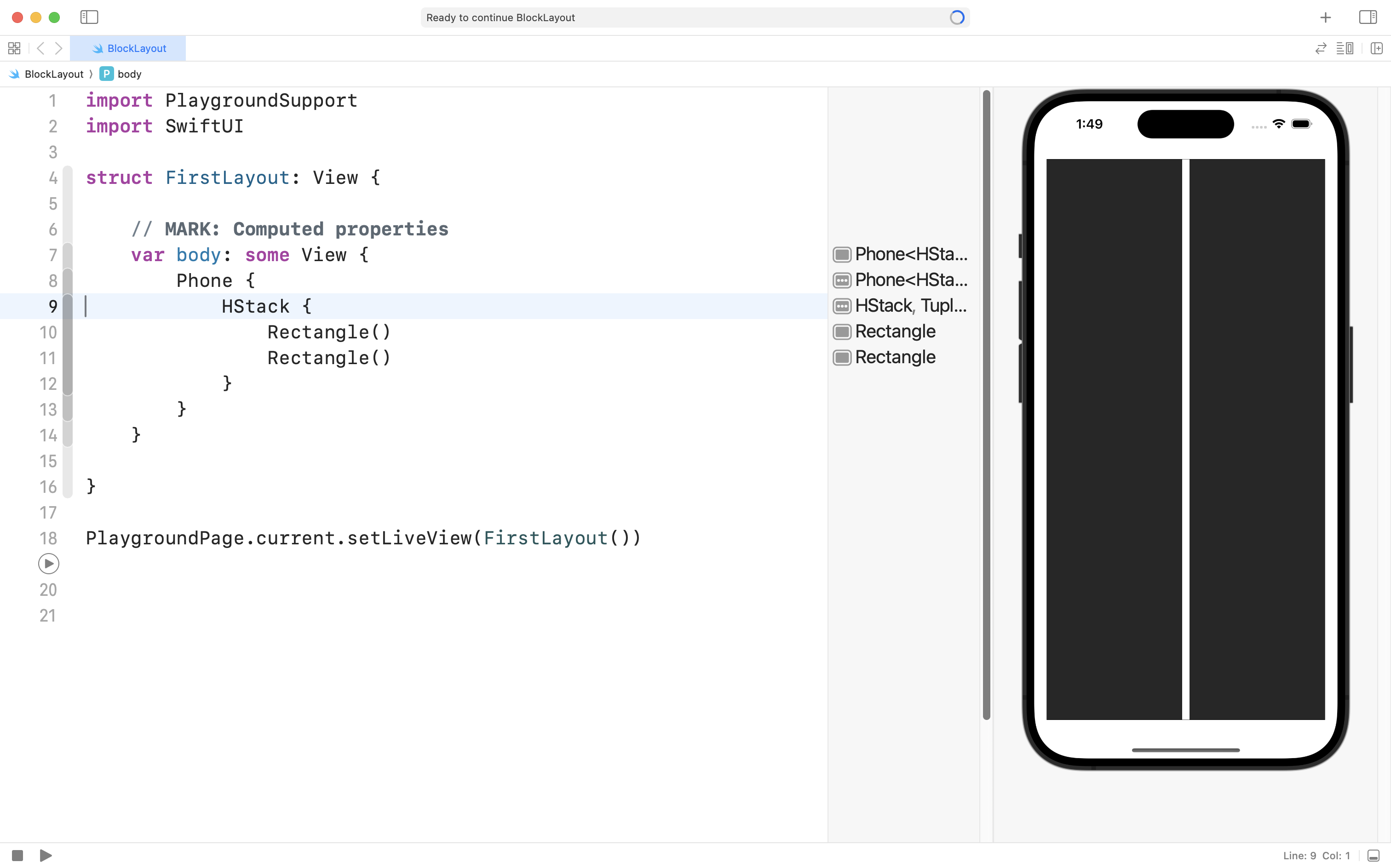
Consider the following code:
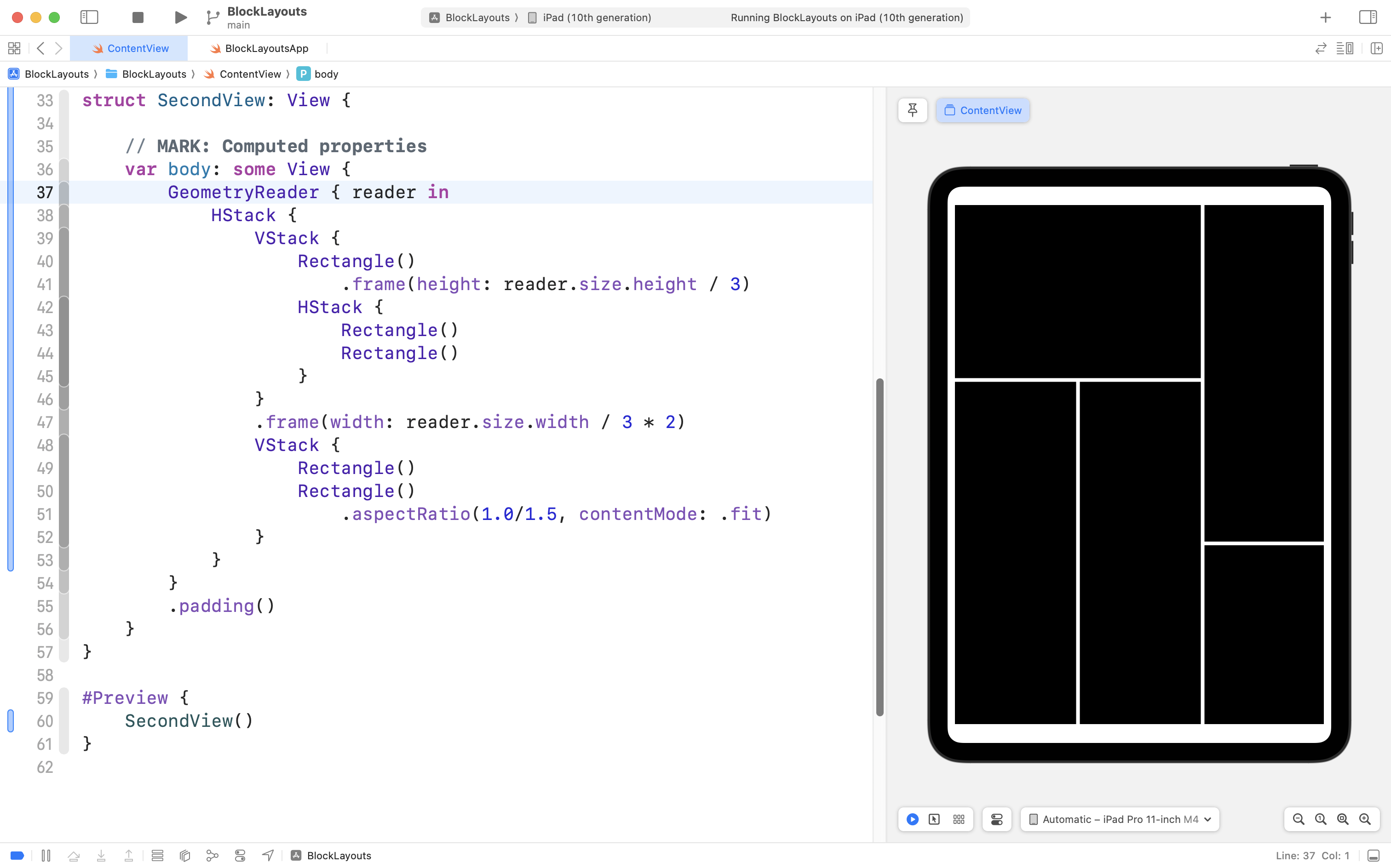
We have added a GeometryReader structure at the top level of the layout.
NOTE
When working within a real project in Xcode (rather than in a Playground) there is no more need to use the
Phonestructure.
The GeometryReader structure, as its name implies, determines the available size of a device, and then allows us to manipulate the size of views using that information:
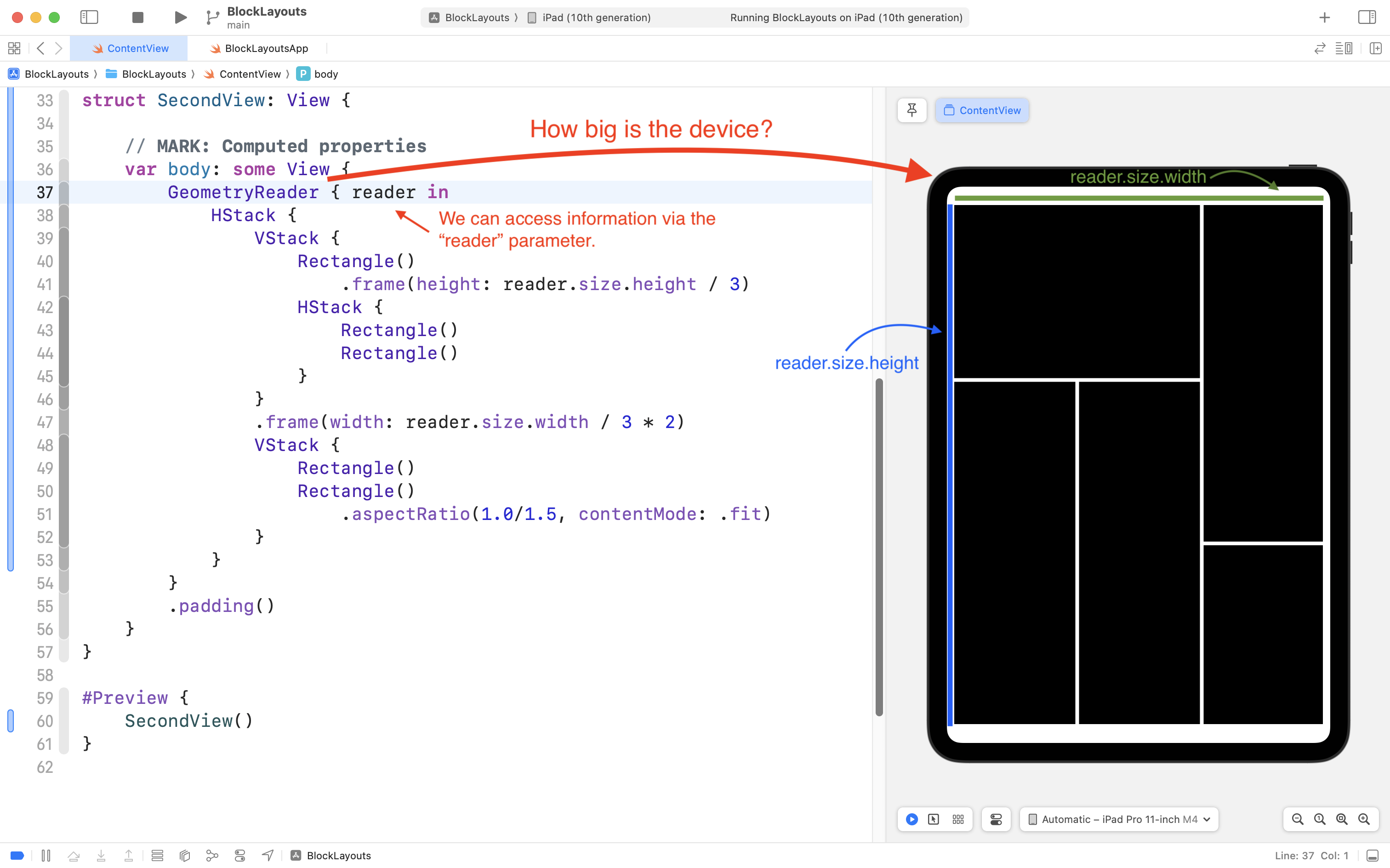
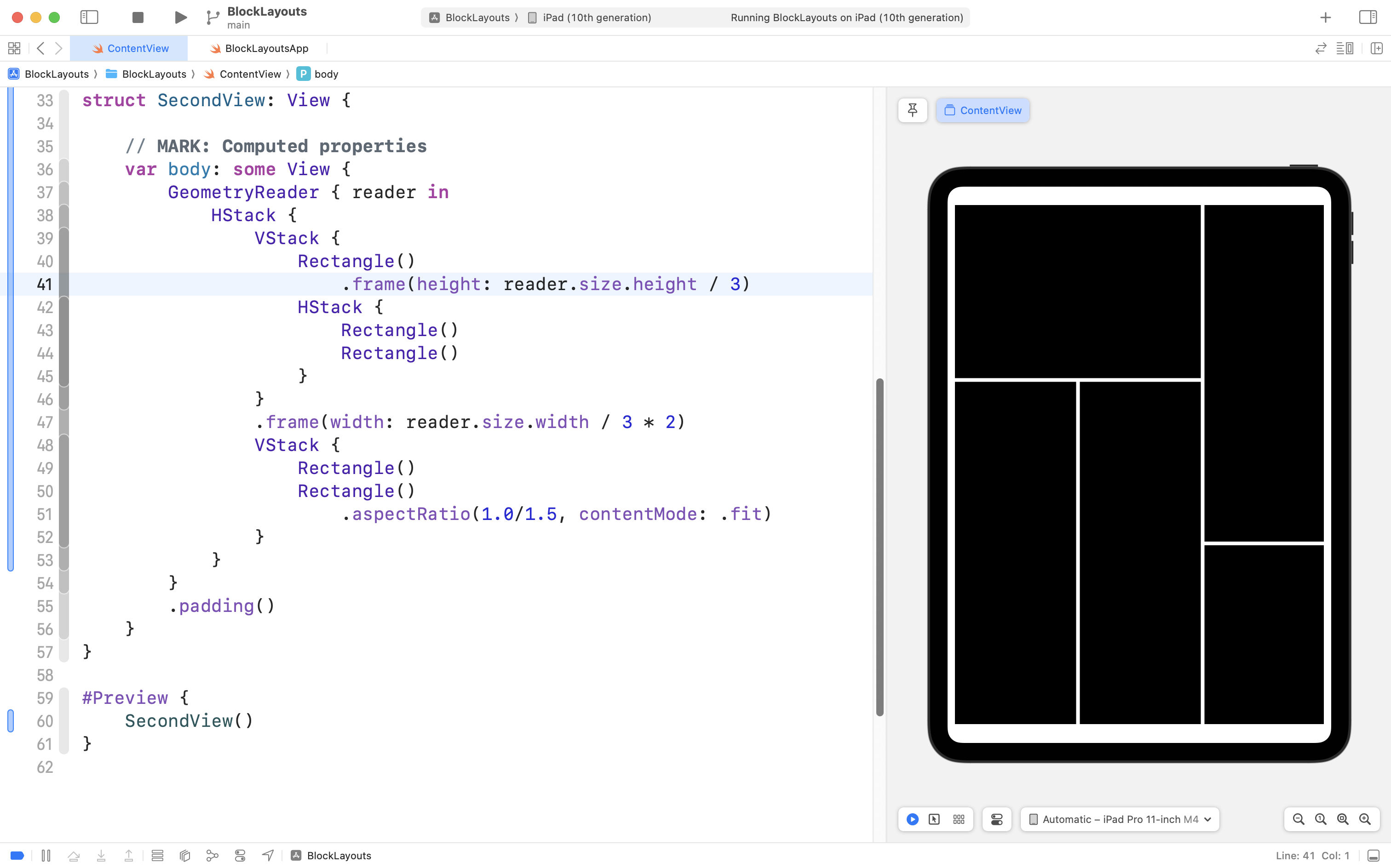
On line 41, we limit the height of the top-left rectangle to one-third of the overall device height:
On line 47, we set the width of the left-hand VStack to be two-thirds of the overall device width:
We do this by using values from the reader parameter, which is populated with information from the GeometryReader structure. We then use the .frame view modifier to explicitly set the width or height of elements of our layout.
If we then try out this code on an iPhone 16 Pro, we see it adapts perfectly:
The GeometryReader is useful, but should be used sparingly, as it adds some additional overhead when the SwiftUI framework displays a user interface within an app.
We will revisit use of the GeometryReader structure later on in this course.